
Alpine Retreat
Brandings
May 13, 2026
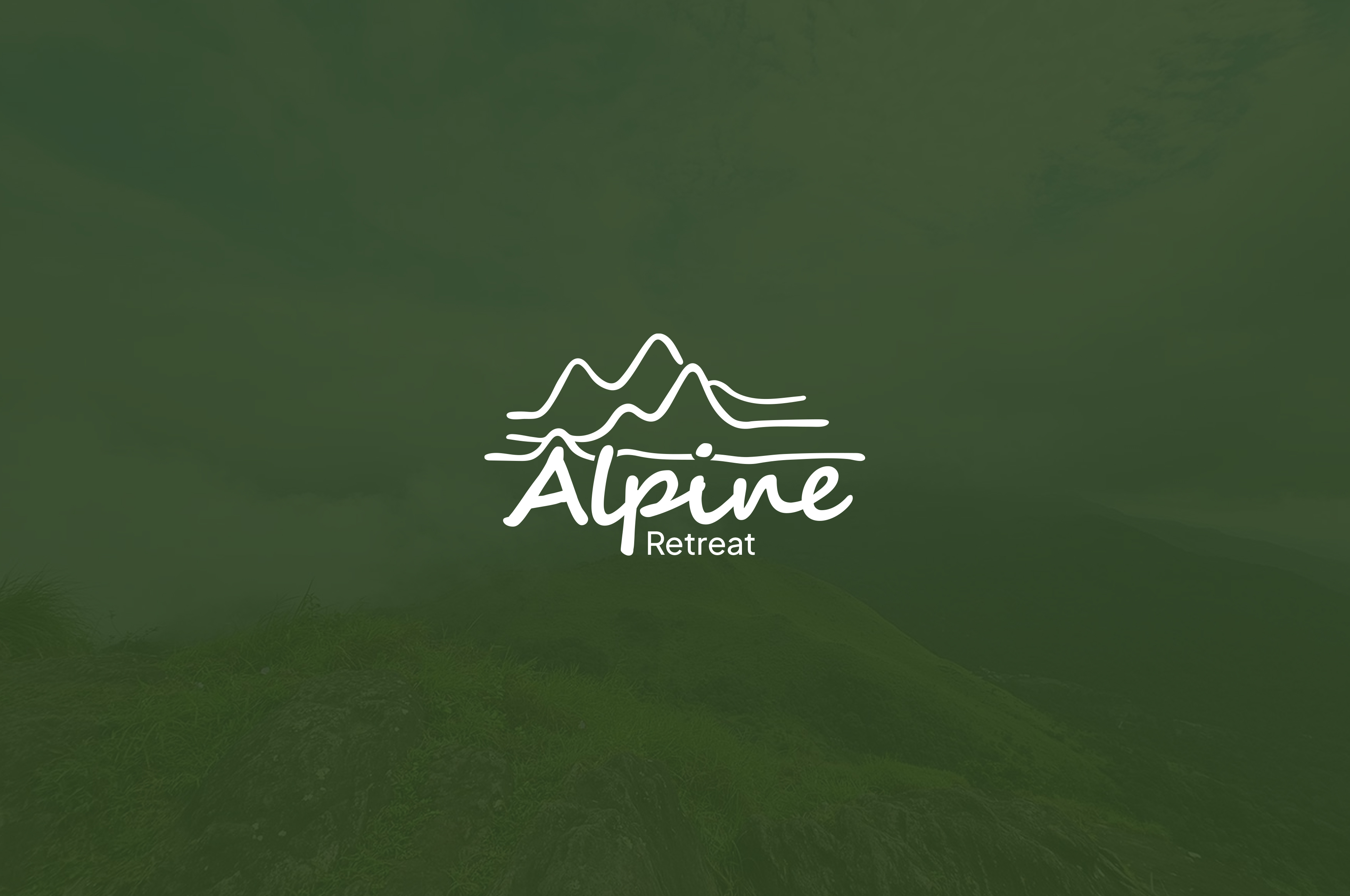
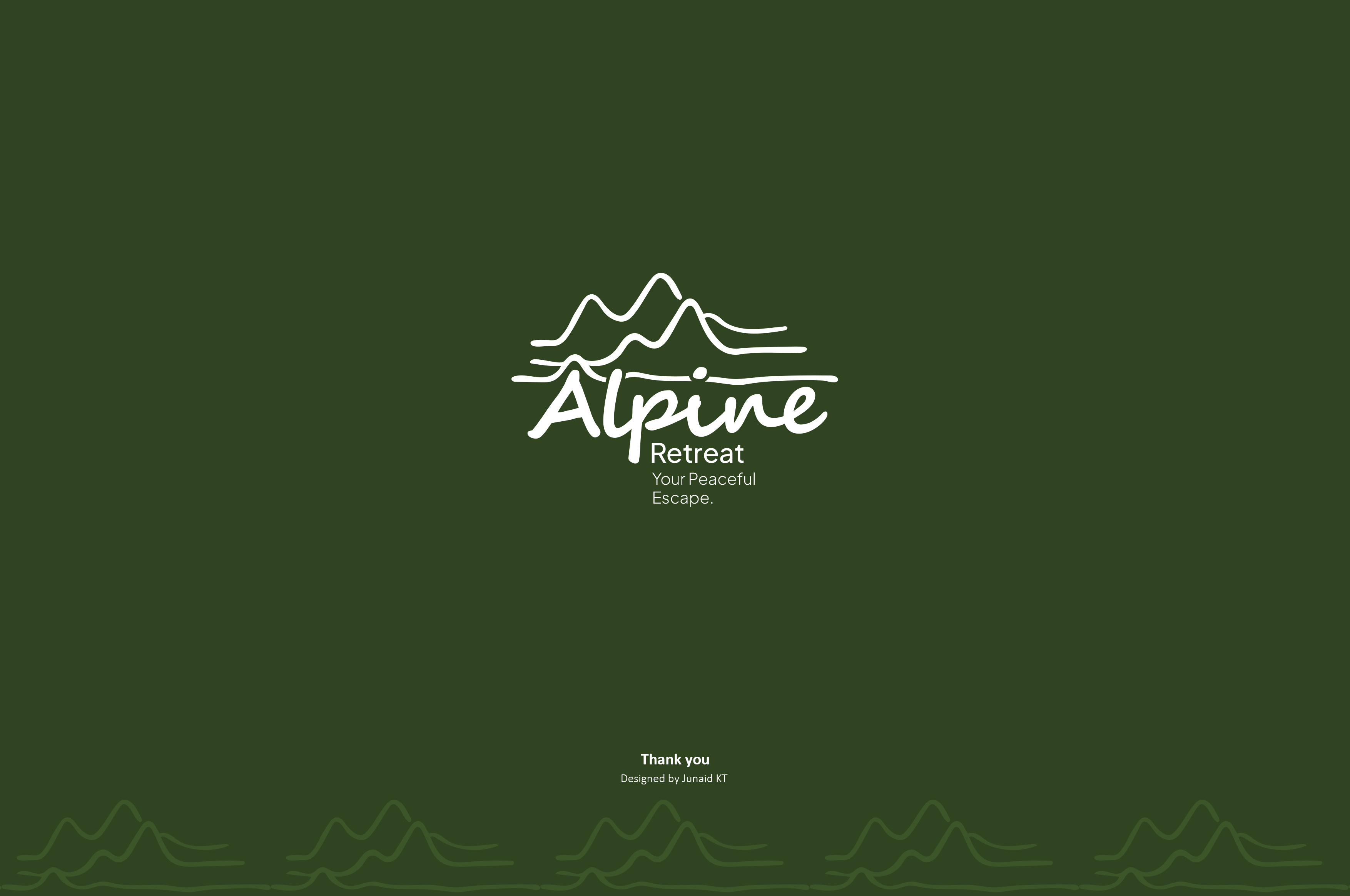
The Alpine Retreat branding is a calm and elegant visual identity designed to capture the peaceful essence of nature, mountains, and luxury relaxation. Created for a resort experience centered around serenity and escape, the logo reflects the beauty of alpine landscapes while maintaining a clean and modern hospitality aesthetic.
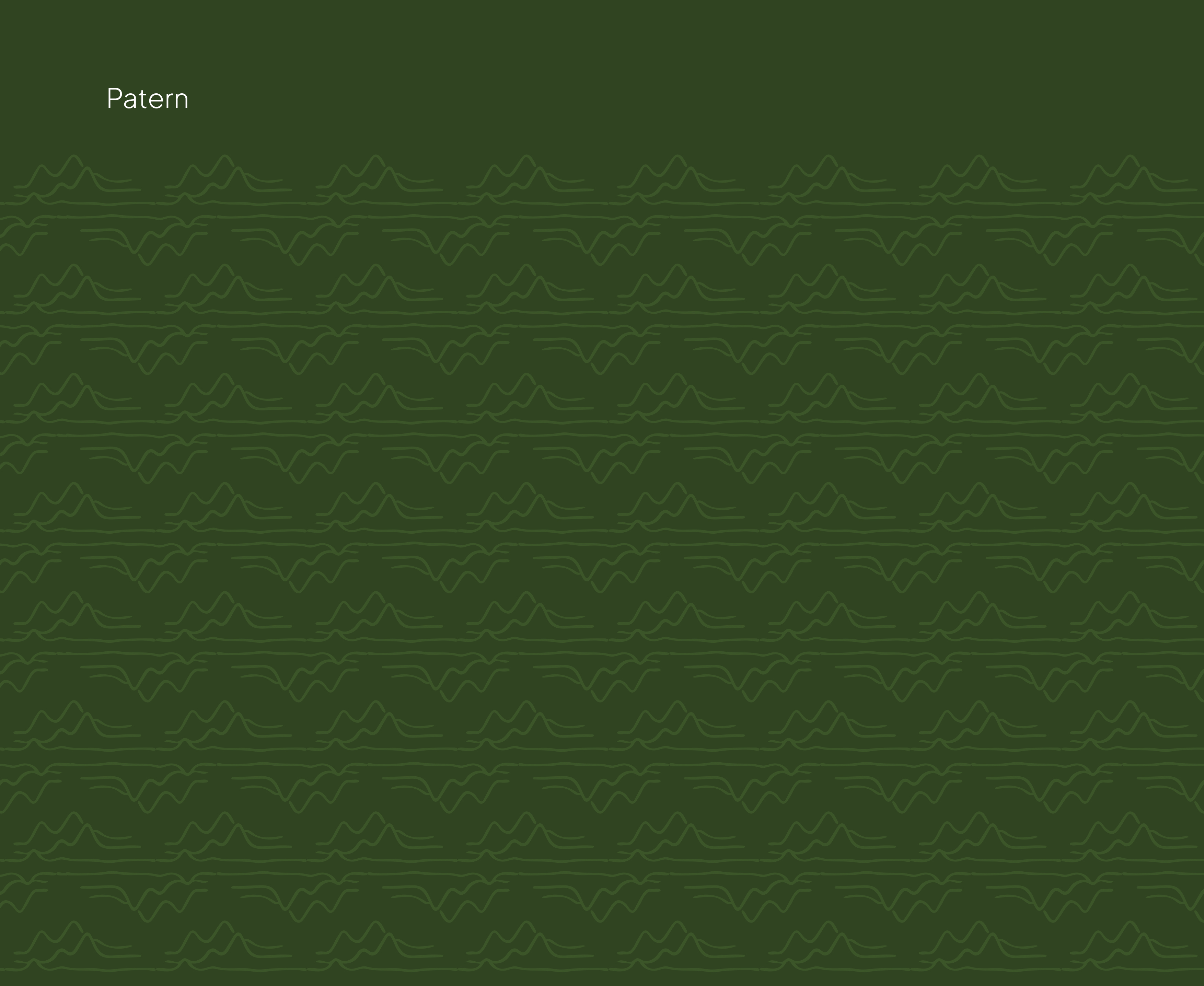
At the heart of the identity is a minimalist line-art mountain illustration integrated seamlessly above the typography. The flowing mountain contours symbolize natural elevation, scenic beauty, and peaceful retreats surrounded by untouched landscapes. The continuous line style creates a soft and organic appearance, giving the brand a sense of calmness and effortless sophistication.
The typography combines a handwritten script style for the word “Alpine” with a clean modern font for “Retreat.” This balance creates a visual contrast between warmth and professionalism. The handwritten lettering introduces a personal and welcoming atmosphere, while the minimal sans-serif typography adds clarity, elegance, and modern hospitality appeal.
The dark green background plays an important role in shaping the brand identity. Green symbolizes nature, tranquility, freshness, and wellness — all qualities associated with mountain resorts and eco-luxury experiences. The soft gradient and natural texture in the background enhance the immersive outdoor feeling, creating an emotional connection with relaxation and scenic destinations.
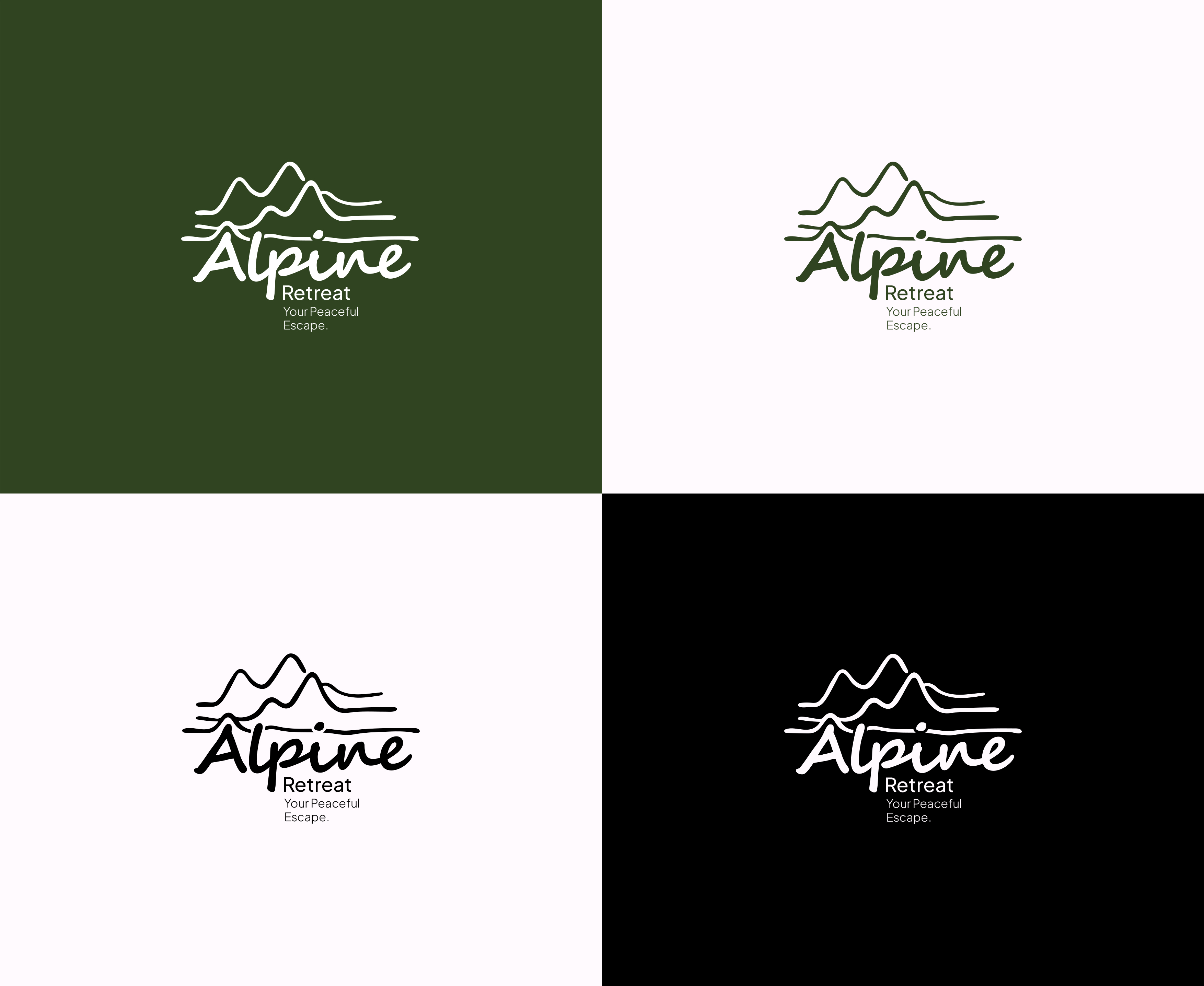
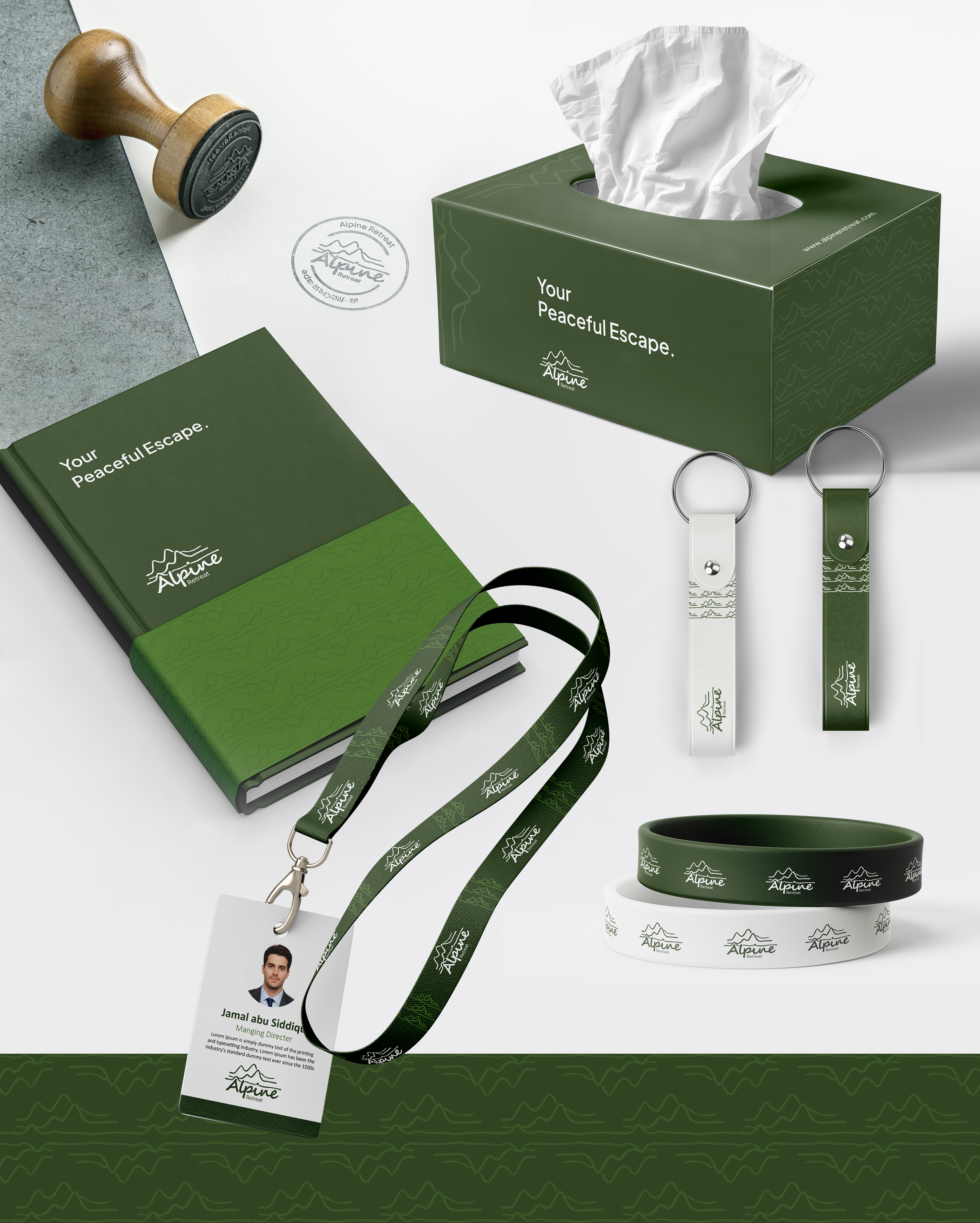
The overall visual composition is intentionally minimal, allowing the logo to feel timeless, premium, and versatile across resort signage, booking platforms, social media, packaging, uniforms, and hospitality marketing materials.
Symbolism Behind the Design
- Mountain line art → Nature, escape, adventure, scenic beauty
- Flowing continuous lines → Calmness, harmony, relaxation
- Handwritten typography → Warm hospitality and personal experience
- Green color palette → Wellness, nature, freshness, eco-luxury
- Minimal composition → Elegance, simplicity, timeless branding
8
No comments yet.