
Flykab
Brandings
May 11, 2026
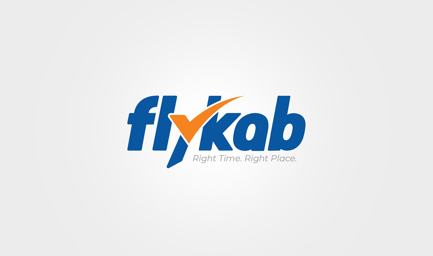
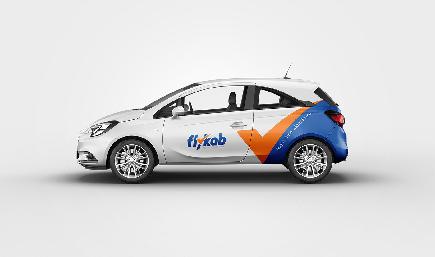
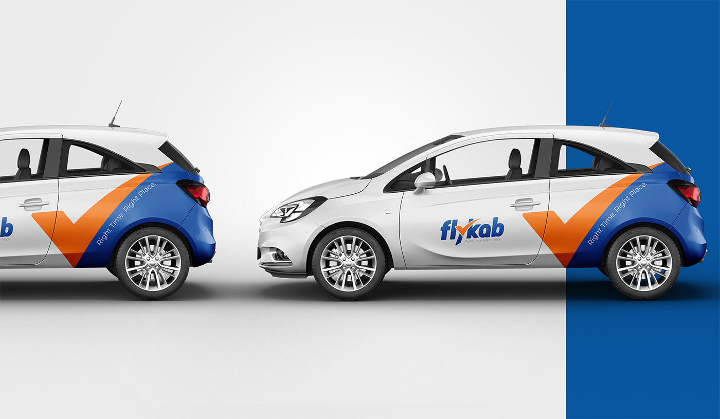
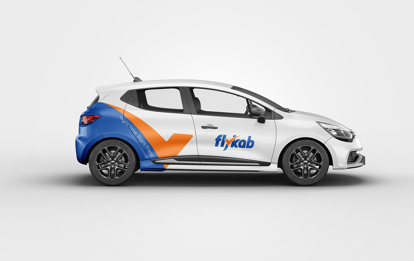
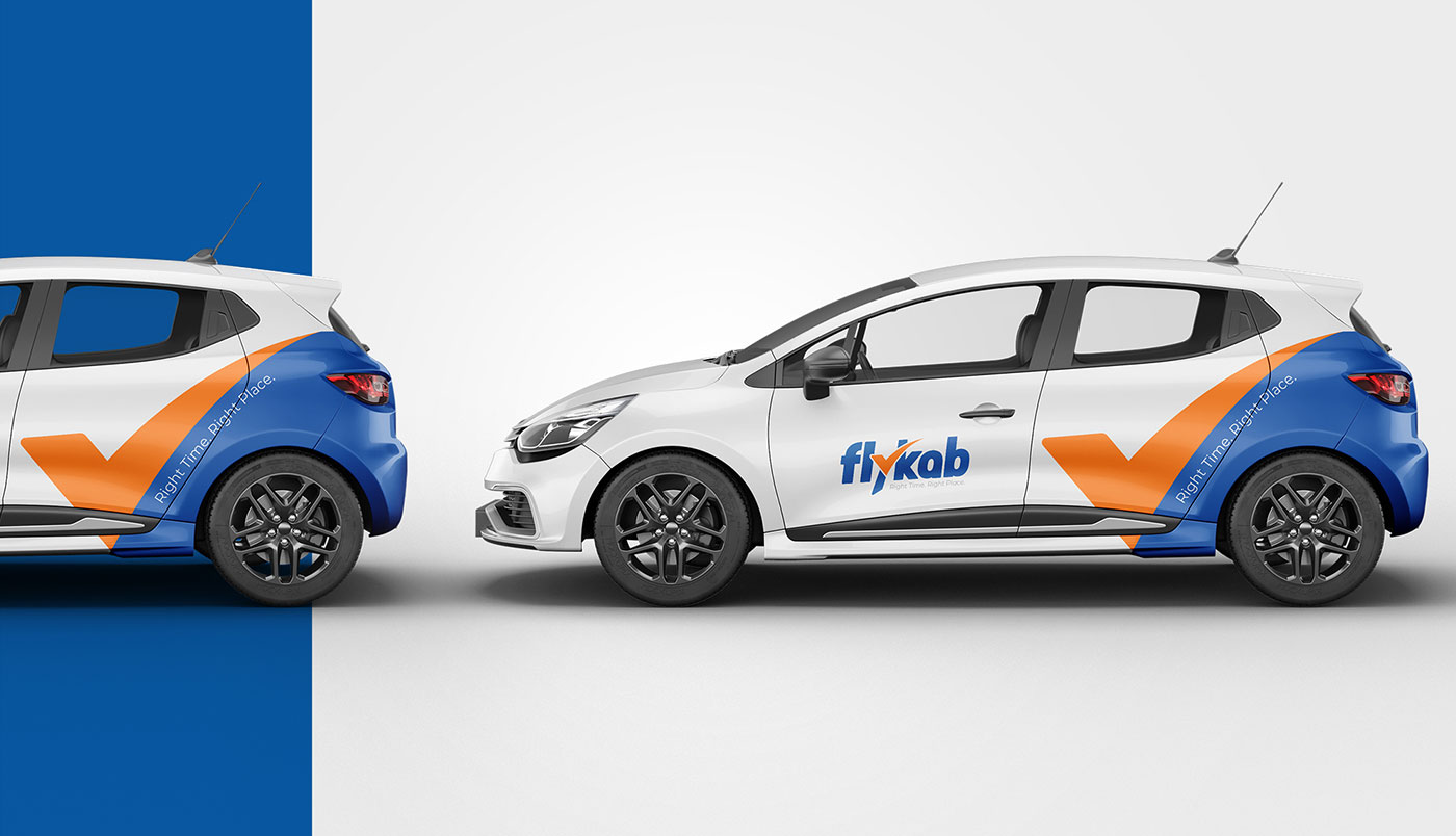
The Flykab logo is a modern and energetic brand identity designed around the idea of smart travel, perfect timing, and reliable destination services. Built with the tagline “Right Time. Right Place.”, the identity visually communicates speed, precision, movement, and trust — all essential qualities for a transportation or travel-focused brand.
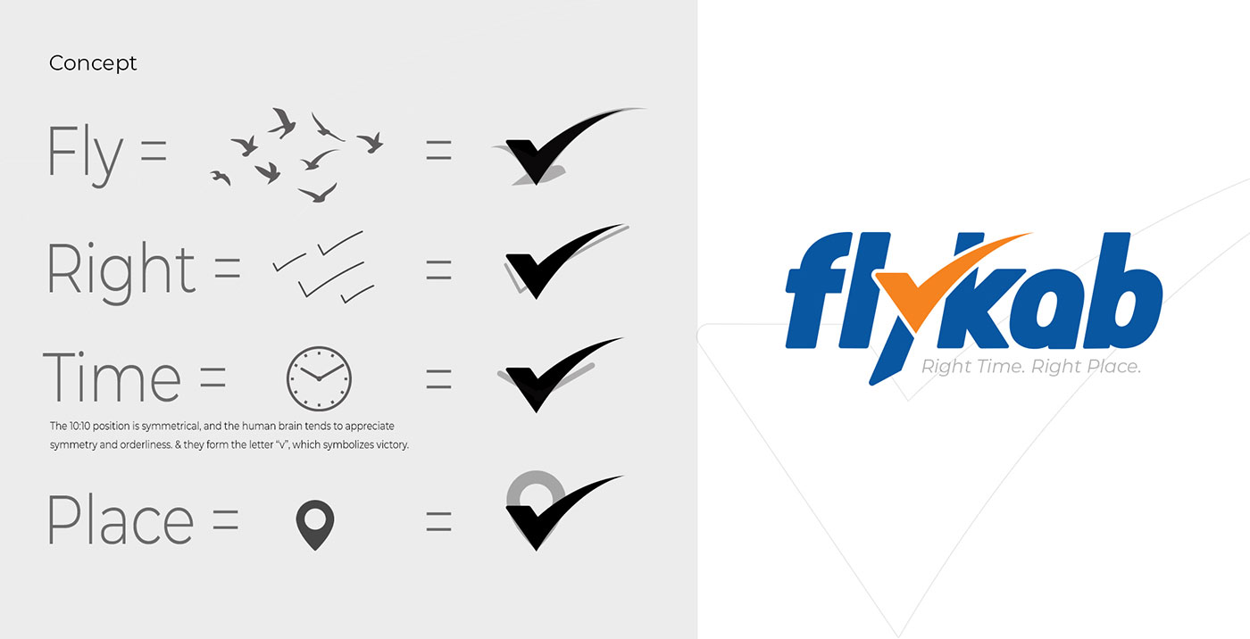
At the center of the logo is a dynamic checkmark symbol integrated seamlessly into the typography. This mark is more than a simple tick; it represents multiple conceptual elements connected to the brand’s mission:
- Flight and movement inspired by birds in motion
- Correct timing through the universal check symbol
- Location accuracy connected to navigation and destination points
- Success and reliability through the visual language of approval and trust
The concept sheet further explains how the checkmark evolves from ideas related to fly, right, time, and place, combining these meanings into a single recognizable brand symbol. The upward sweeping motion of the mark creates a sense of forward momentum and progress, reinforcing the idea of smooth travel experiences and efficient service.
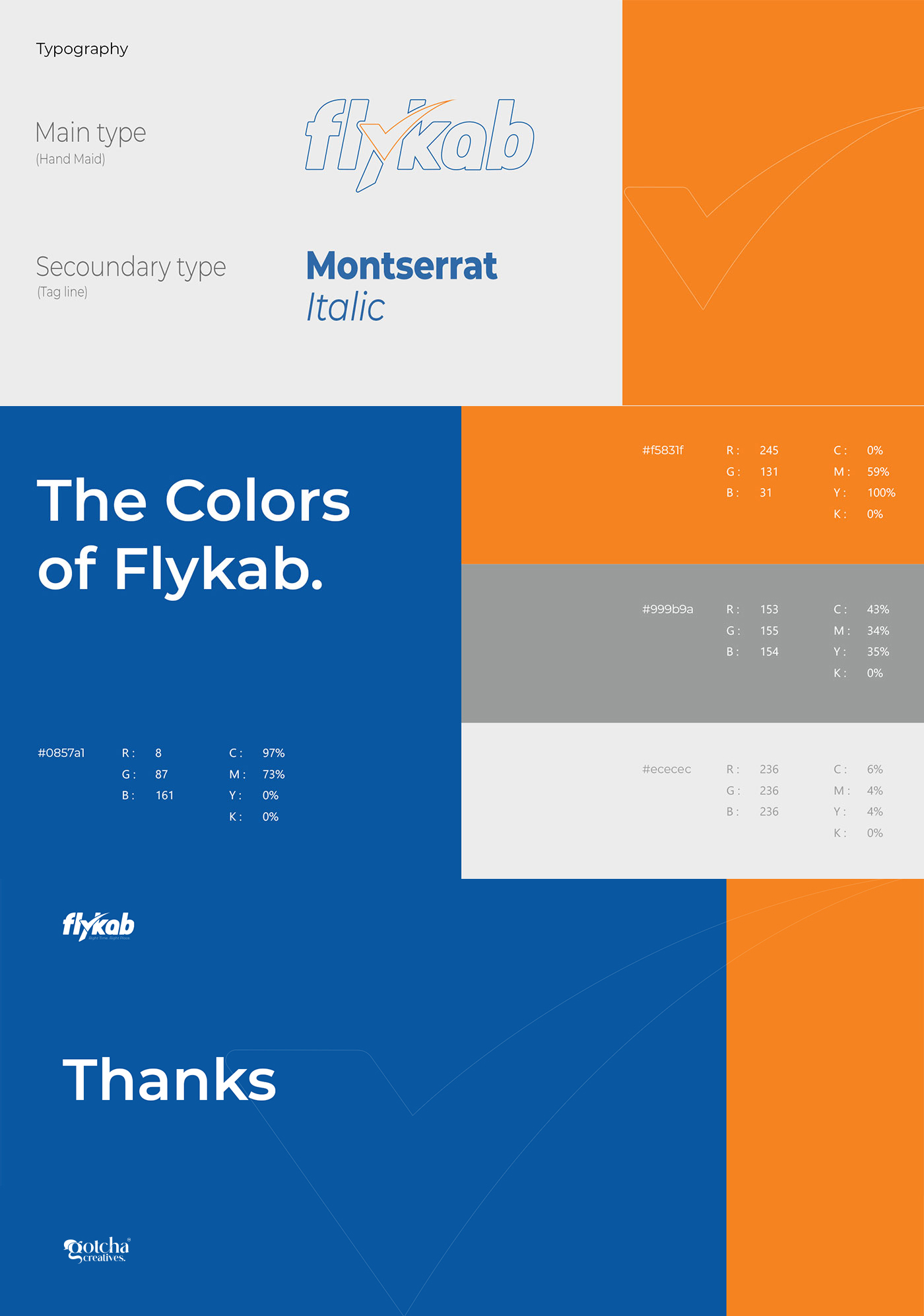
The typography is bold, italicized, and slightly forward-leaning, visually enhancing the feeling of motion and speed. The custom arrangement of the lettering creates a strong and memorable identity while maintaining clarity and modern appeal. The stylized “y” connects naturally with the checkmark, making the icon and typography function as one cohesive unit.
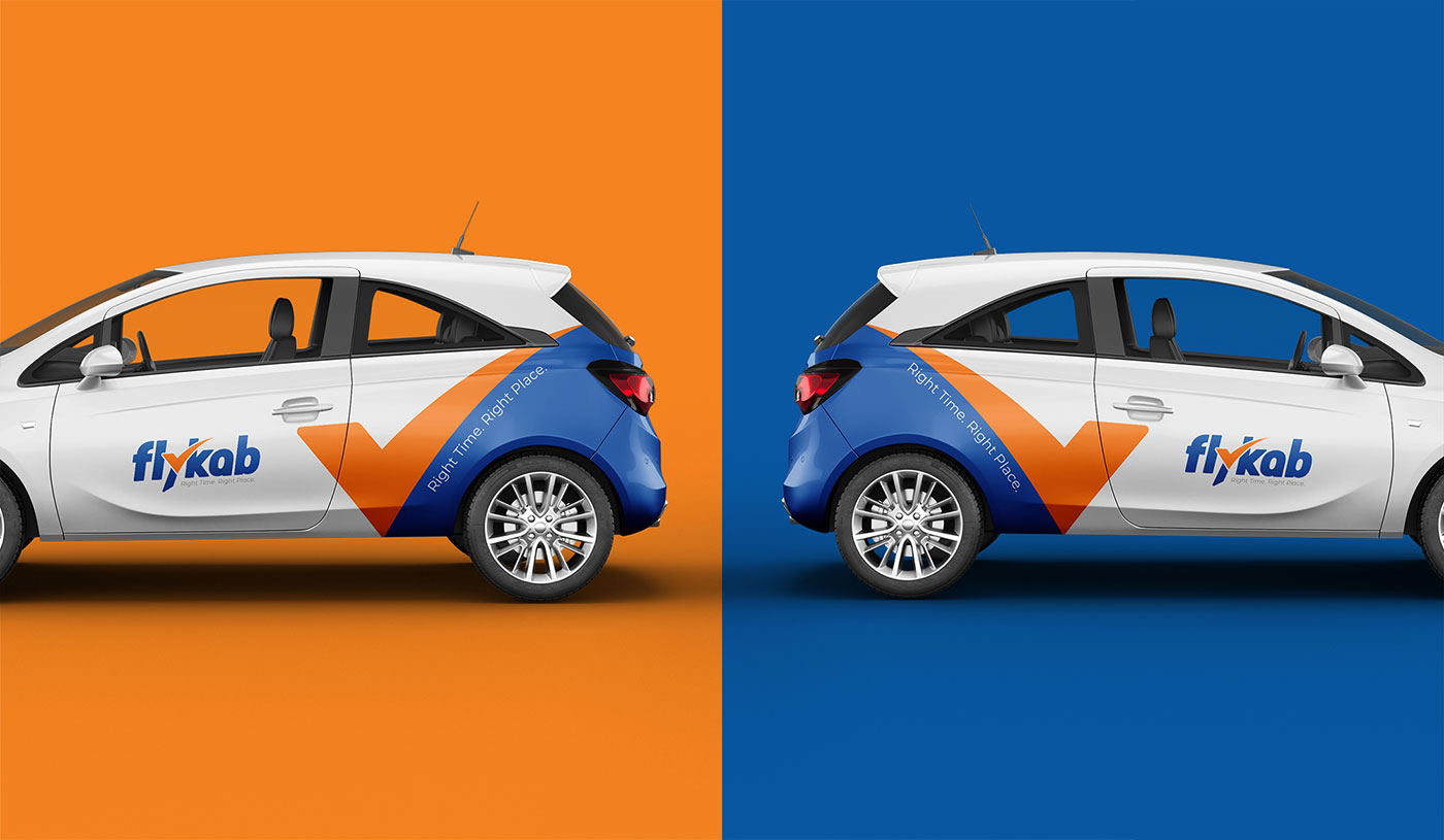
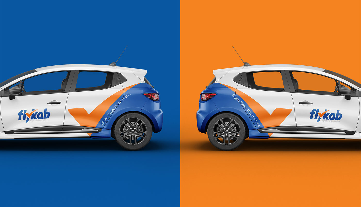
The color palette plays an important role in shaping the brand personality:
- Blue symbolizes trust, professionalism, technology, and reliability
- Orange represents energy, movement, positivity, and customer confidence
This contrast creates a vibrant and approachable identity that feels both dependable and dynamic.
The Flykab logo represents a transportation and mobility brand that values punctuality, precision, and seamless customer experiences. By combining the symbolism of movement, timing, approval, and navigation into one unified visual system, the identity communicates confidence and efficiency. The brand stands as a promise to get customers to the right place at the right time with reliability and ease.
9

No comments yet.