
Crop
Brandings
May 11, 2026
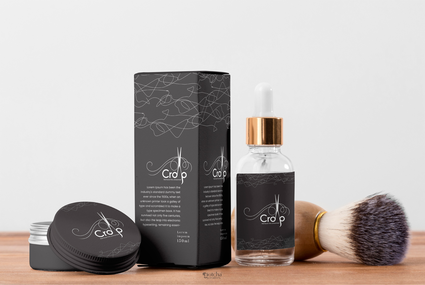
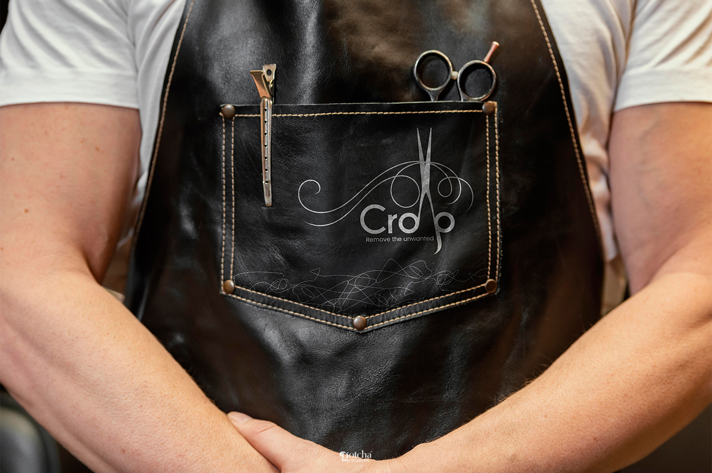
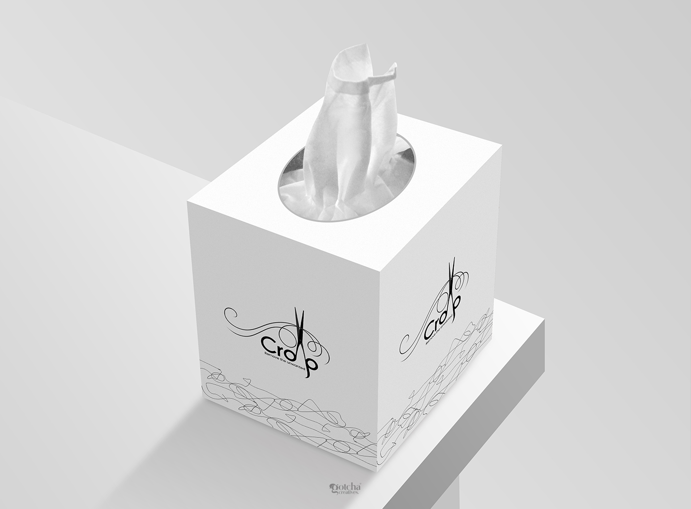
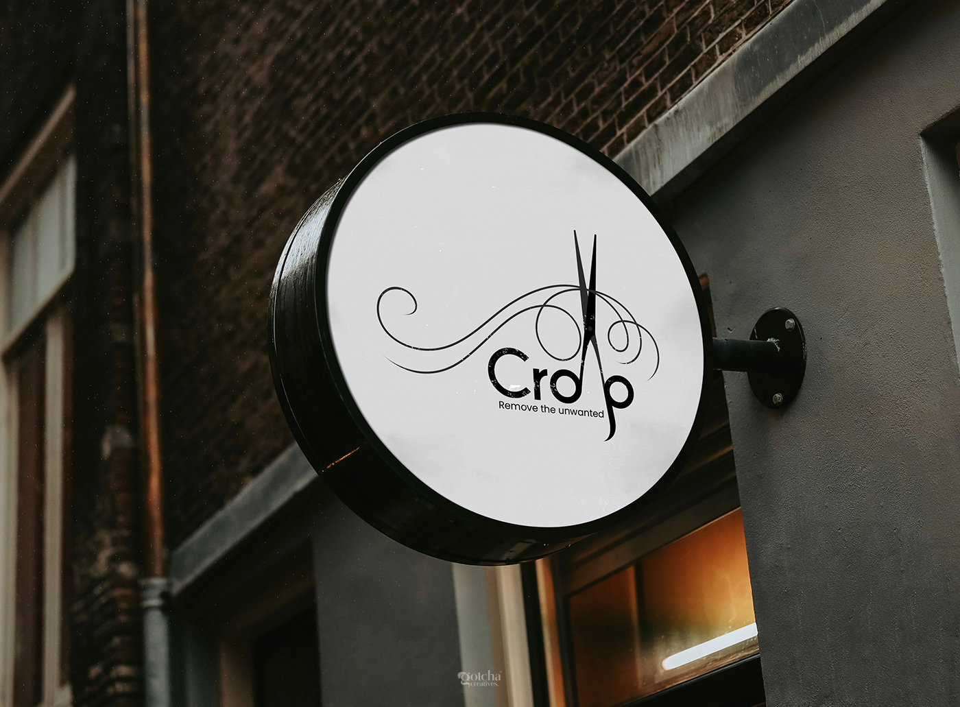
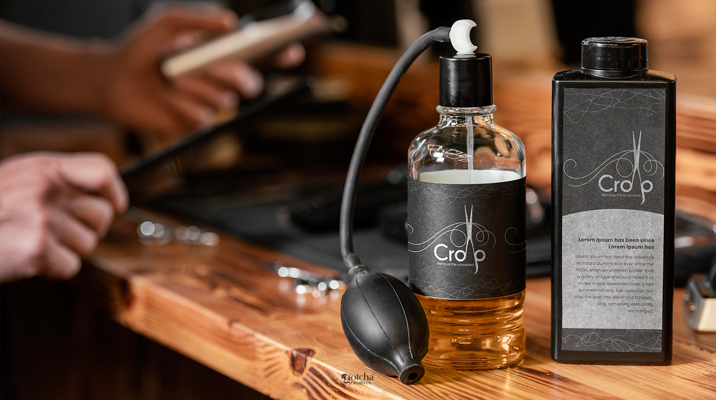
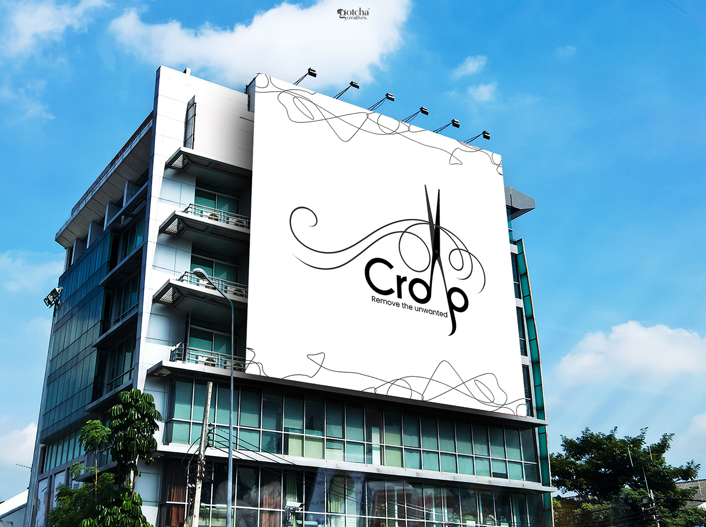
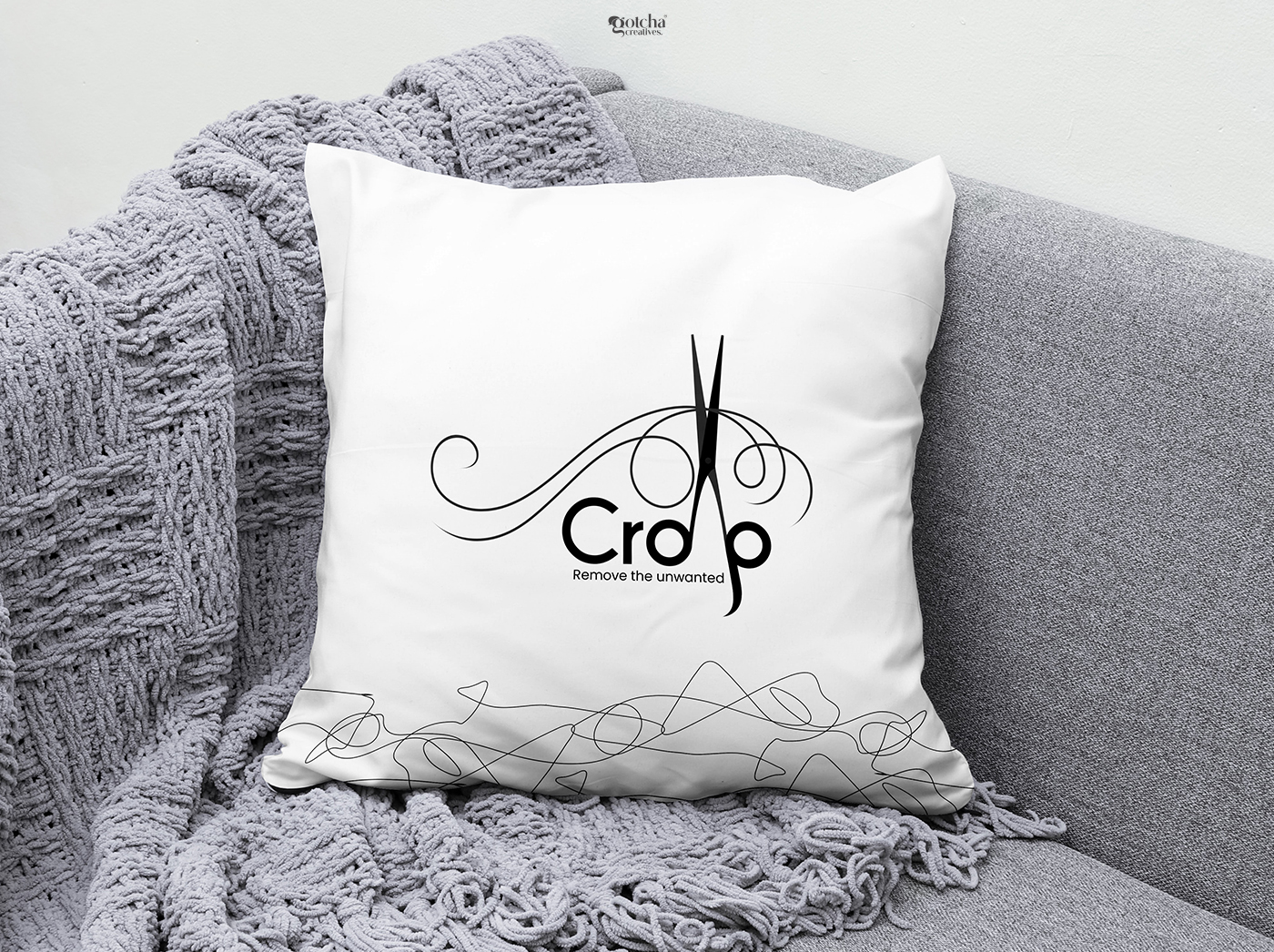
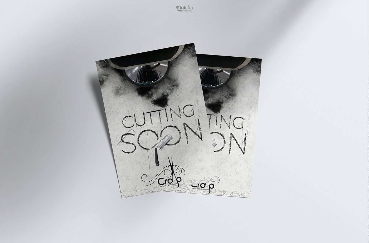
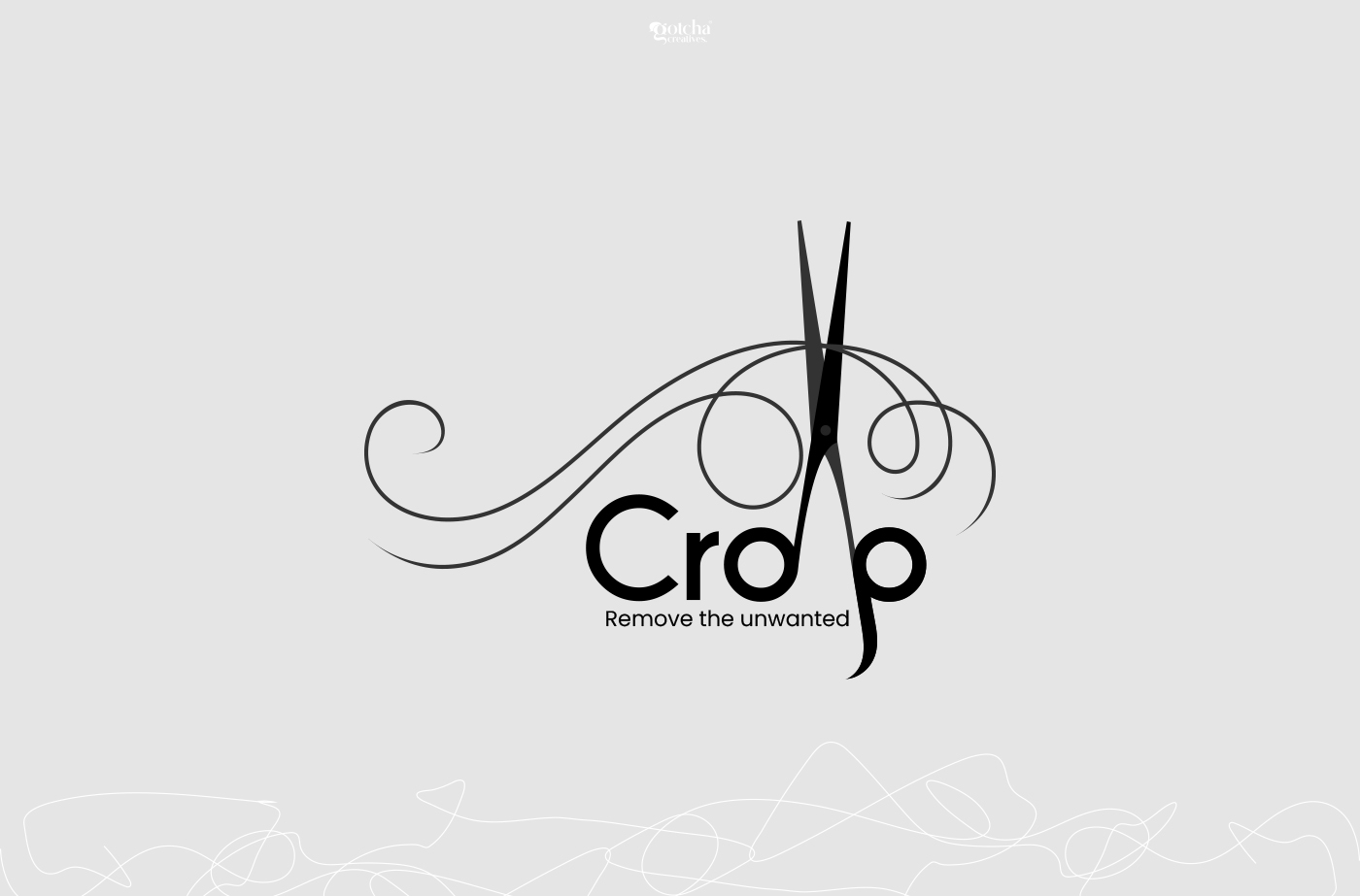
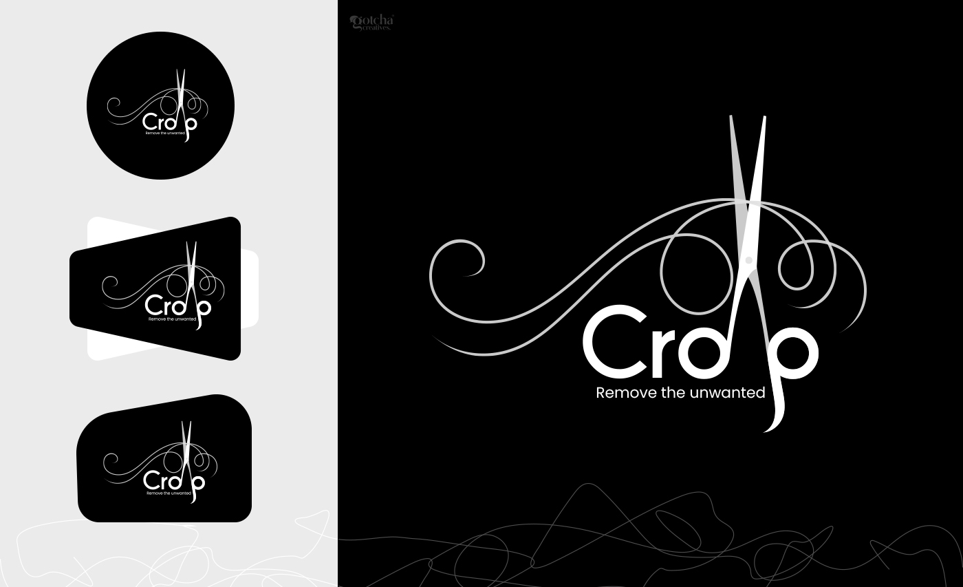
The Crop logo is a refined visual identity built around the idea of transformation, precision, and elegance. Inspired by the act of cutting away what is unnecessary, the logo communicates the brand’s core philosophy: “Remove the unwanted.”
At the heart of the design is a stylized scissor silhouette, seamlessly integrated into the typography. Rather than using a literal icon placed beside the name, the scissors become part of the wordmark itself — symbolizing that the brand’s service is not separate from its identity, but embedded into its purpose. This creates a smart and memorable visual connection between the brand name and the action it represents.
The flowing ornamental curves surrounding the logo introduce a sense of movement, softness, and artistic craftsmanship. These elegant lines resemble strands of hair, fabric cuts, or creative strokes, reinforcing themes of beauty, styling, refinement, and detail-oriented work. The contrast between the sharp scissors and the smooth flowing curves visually represents the balance between precision and creativity.
The typography is modern, bold, and minimal, ensuring strong readability while maintaining a premium appearance. The rounded letterforms create a friendly and approachable personality, while the black monochrome palette adds sophistication, professionalism, and timelessness. The subtle integration of curves into the composition elevates the logo into a more luxurious and fashion-inspired identity.
Symbolism Behind the Design
- Scissors → Precision, transformation, removal, craftsmanship
- Flowing curves → Creativity, elegance, beauty, movement
- Minimal black palette → Luxury, professionalism, confidence
- Integrated typography → Unity between brand identity and service
The Crop identity represents more than cutting — it represents refining, reshaping, and enhancing. Whether connected to beauty, grooming, fashion, editing, or creative services, the logo visually communicates the idea of removing imperfections to reveal something cleaner, sharper, and more beautiful.
9
No comments yet.