
Born Bee
Brandings
Nov 14, 2025
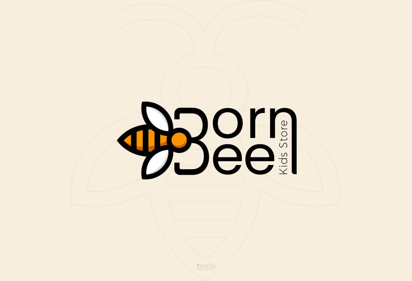
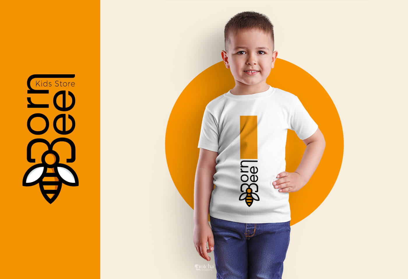
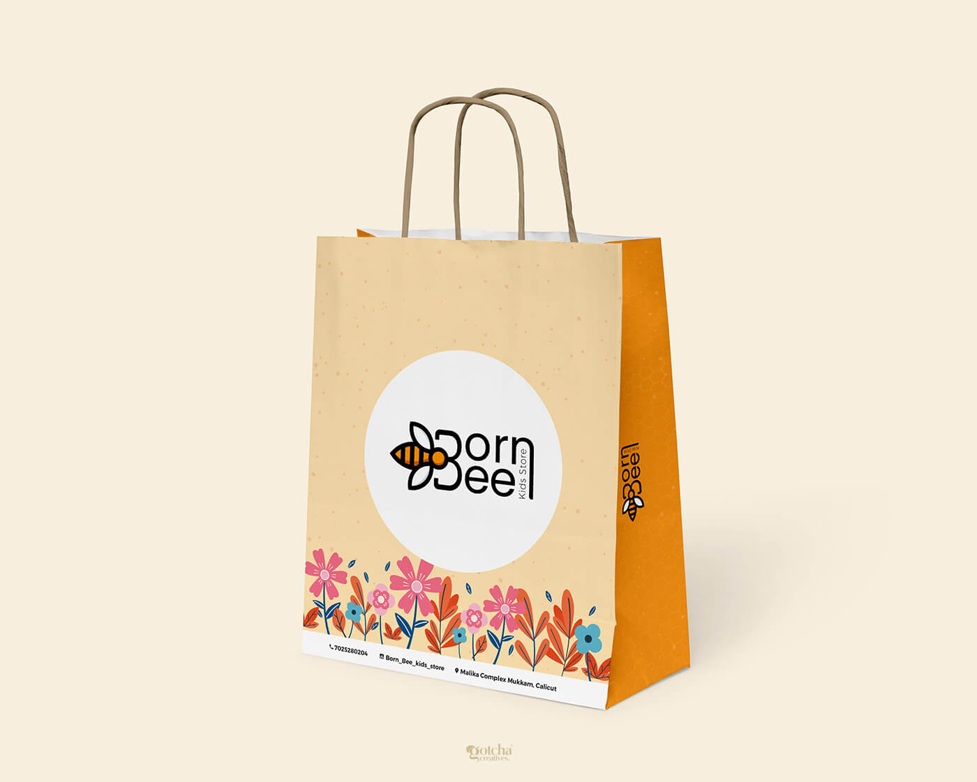
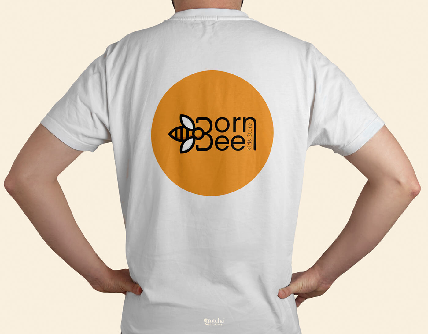
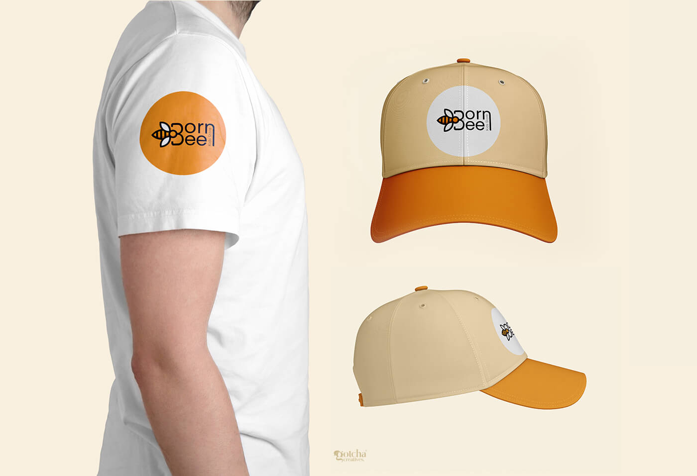
For Born Bee Kids Store, we developed a complete and cohesive branding identity that reflects joy, innocence, and creativity. Since the store focuses on kids' clothing and accessories, our goal was to craft a visual language that feels playful, memorable, and instantly recognizable to both children and parents.
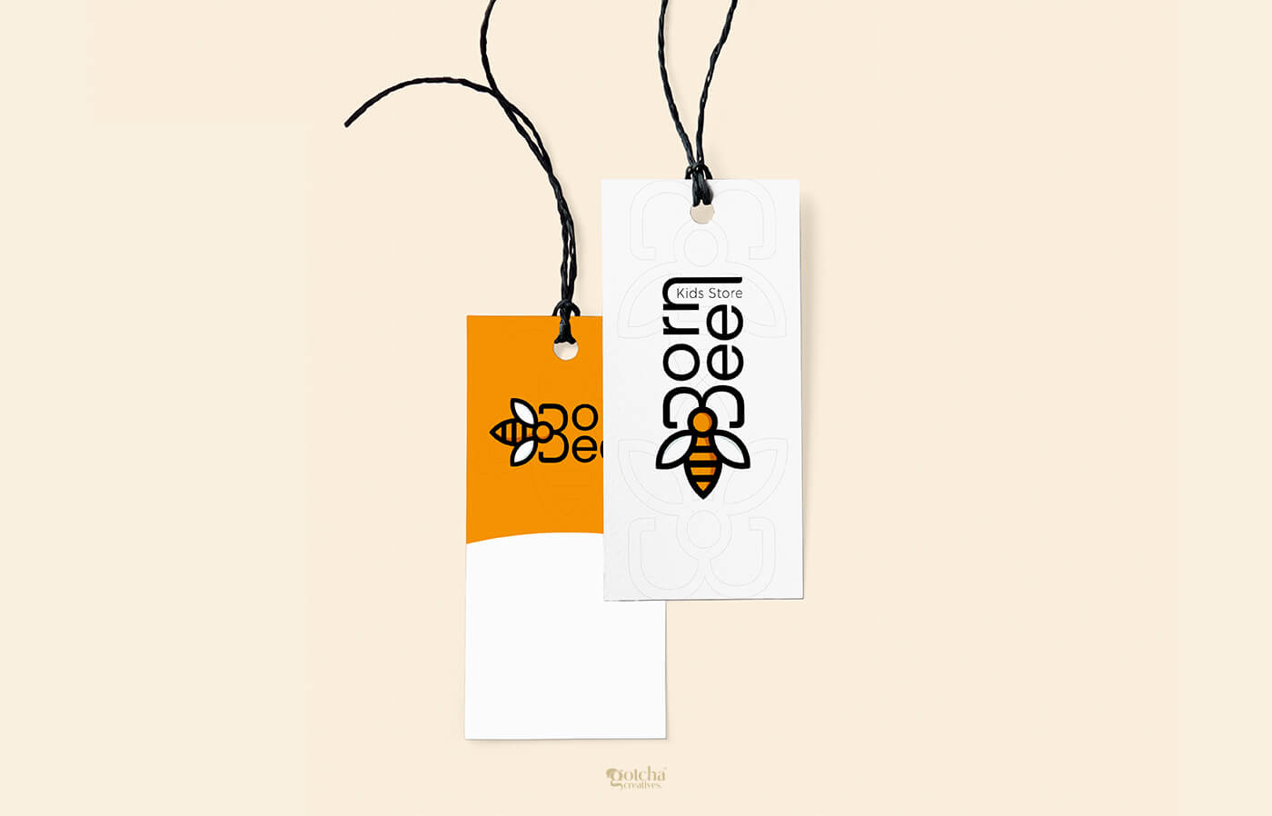
Logo Design : The brand name “Born Bee” inspired a bee-themed identity symbolizing energy, curiosity, and childhood liveliness. We designed a modern, clean, and friendly bee icon paired with rounded typography to create a soft and welcoming feel. The combination of warm orange and bold black helps the logo stand out while maintaining a cheerful tone suitable for kids' retail.
Visual Identity : Simple shapes and rounded forms, Soft beige and warm yellow tones, Bee-inspired patterns for consistency, Clean, kid-friendly design elements. This identity flows smoothly across all brand touchpoints.
27
Arman Nair
11 months agoVery refined work great sense of style and proportion.
Gotcha Creatives
11 months agoThank you! Appreciate the feedback.